


Views for this exhibit
4 images
An exhibit direction that adds more lounge or meeting energy without sacrificing circulation clarity.
InfoComm in Las Vegas is a strong fit for this 20 x 30 island direction because the design prioritizes conversation-friendly planning and more welcoming dwell zones and a cleaner path into larger AV programs that need multiple demo surfaces, clearer zoning, and open access from all sides.
Footprint
20' x 30'
Exhibit type
Island
Views included
4
Working area
600 sq ft / 56 m²
4 images
Design-specific LED-wall video
This exact 20' x 30' design includes a 32-second LED-wall preview alongside the still-view gallery so you can evaluate motion, screen emphasis, and arrival sequence together.
Why exhibitors choose this design
Here is what this design does for your team on the floor — how it earns attention, makes conversations easier, and turns exhibit traffic into real leads.
An exhibit direction that adds more lounge or meeting energy without sacrificing circulation clarity.
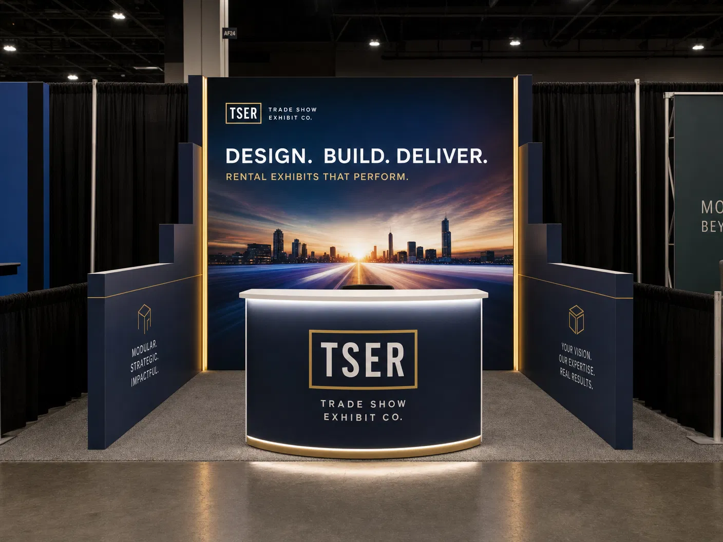
20 x 30 Exhibit Rental — Hospitality-forward island design is built for exhibitors heading to InfoComm in Las Vegas. InfoComm is the world's largest professional audiovisual trade show, attracting over 30,000 attendees including manufacturers, integrators, dealers, and end-users. The event showcases the latest in AV technology and provides a platform for networking and education within the industry. The 2025 edition featured 817 exhibitors across a 400,100 net square foot show floor. On that floor, the hospitality-forward island design layout works because it gives the exhibit a clean front read, a strong flow inside, and an easy path from the first aisle glance to a real conversation. An exhibit direction that adds more lounge or meeting energy without sacrificing circulation clarity. This is a working rental exhibit, not a decoration: it helps your team get the message across faster, sort traffic, and present the brand with more control during a busy show.
On size, this 20 x 30 island build gives your team roughly 600 square feet to do three things at once: stop the aisle with a clear front, support multi-surface media experience, and keep enough room for staff conversations after the first stop. It does that through conversation-friendly planning, more welcoming dwell zones, and balanced circulation and hospitality, so the exhibit never collapses into one long wall or one empty open space. That is why it fits InfoComm well. The exhibit carries your branding, product story, and meeting space in one easy-to-read sequence, which is what you want when you are renting an exhibit in a market like Las Vegas.
Build quality matters just as much. An exhibit only works if it can be built, packed, and installed without the look falling apart on site. In this design, the open-sided frame run, overhead branding, and perimeter counters are coordinated to keep all four sides open and easy to walk. That lets us plan the exhibit around the aluminum frame system, SEG graphic spans, monitor count, counter placement, crating, and labor hours up front. General-contractor line-of-sight rules also stay in the plan, so corners, front message walls, and overhead signage do not run into approval or visibility problems on the floor. For a show like InfoComm, that gives the exhibit the practical discipline to hold up under real event conditions, from move-in through show hours and on to your next event.
Bottom line: would this exact 20 x 30 exhibit help you at InfoComm in Las Vegas? Yes, when your program needs larger AV programs that need multiple demo surfaces, clearer zoning, and open access from all sides. The hero image and the other views show how the exhibit holds up from every approach, and the details explain why the structure fits the venue, the traffic, and the job the exhibit has to do. This is a real 20 x 30 Exhibit Rental — Hospitality-forward island design build with the practical planning detail to support pricing discussions, graphics decisions, and a straightforward rental conversation with our team. Call 888-633-5197 or request a quote to get started.
What you get with this build
Gets noticed from down the aisle
A clear hero moment and conversation-friendly planning pull attendees in before they walk past — so more of the right people stop at your exhibit.
Easier conversations, more leads
The layout gives your team room to greet, demo, and talk without a bottleneck, so exhibit traffic turns into real conversations instead of a crowd that drifts by.
No show-floor surprises
It is planned to meet Las Vegas Convention Center rules and stays open and on-brand, so it looks the way you expect on day one — with one team handling design, build, and install.
We designed this 20' x 30' build with InfoComm in mind — the kind of crowd, pace, and floor you will be working at Las Vegas Convention Center. If that is your show, it is a strong starting point you can make your own.
Planning highlights
Here is what this exhibit is designed to do on the floor, so you can see the thinking behind it before we scope your quote.
Conversation-friendly planning
This move is part of the design from the beginning so the exhibit can be engineered, installed, and staffed as one coherent system.
More welcoming dwell zones
This move is part of the design from the beginning so the exhibit can be engineered, installed, and staffed as one coherent system.
Balanced circulation and hospitality
This move is part of the design from the beginning so the exhibit can be engineered, installed, and staffed as one coherent system.
The design stays realistic to 20' x 30', so structure, message order, and visitor flow do not drift away from the actual exhibit size.
Supporting gallery
The hero image stays primary, but the full gallery remains available below so your team can compare frontage, side treatment, and the overall operating sequence before asking for revisions.
Other directions in this footprint
These alternate custom exhibits stay visible here with one image and one summary each, so you can compare the created directions without losing track of the current design.

A balanced island direction focused on four-sided access, media presence, and approachable entry points.
MRO Americas in Orlando is a strong fit for this 20 x 30 island direction because the design prioritizes four-sided circulation and readable media placement and a cleaner path into aviation exhibitors that need stronger meeting density, open equipment storylines, and a more technical perimeter read from multiple aisles.

A brighter island direction organized around an overhead perimeter volume, bold edge messaging, and open central engagement.
PACK EXPO Las Vegas in Las Vegas is a strong fit for this 20 x 30 island direction because the design prioritizes suspended perimeter canopy volume and open central interaction zone and a cleaner path into packaging and processing programs that need heavier product storylines, meeting space, and disciplined traffic routing around active displays.

A more sculptural exhibit direction with stronger branded architecture and higher-impact media framing.
IAAPA Expo in Orlando is a strong fit for this 20 x 30 island direction because the design prioritizes stronger branded architecture and flagship media framing and a cleaner path into attractions brands that need immersive messaging, wide approach angles, and a hospitality rhythm that still feels operationally controlled.