


Vistas de este stand
4 images
Una dirección en línea más arquitectónica con zonas de contenido más claras y ritmo visual más fuerte.
KBIS in Las Vegas is a strong fit for this 10 x 20 inline direction because the design prioritizes clear content zoning and architectural wall rhythm and a cleaner path into kitchen-and-bath brands that need cleaner finish stories, a stronger hero wall, and a more controlled consultation zone.
Superficie
10' x 20'
Tipo de stand
En línea
Vistas incluidas
4
Working area
200 sq ft / 19 m²
4 images
Video del muro LED específico del diseño
Este diseño exacto de 10' x 20' incluye una vista previa de 32 segundos en pared LED junto a la galería de imágenes fijas para que pueda evaluar el movimiento, el énfasis en la pantalla y la secuencia de llegada en conjunto.
Por qué los expositores eligen este diseño
Esto es lo que este diseño hace por su equipo en el piso de la feria: cómo capta atención, facilita las conversaciones y convierte el tráfico del stand en oportunidades reales.
Una dirección en línea más arquitectónica con zonas de contenido más claras y ritmo visual más fuerte.
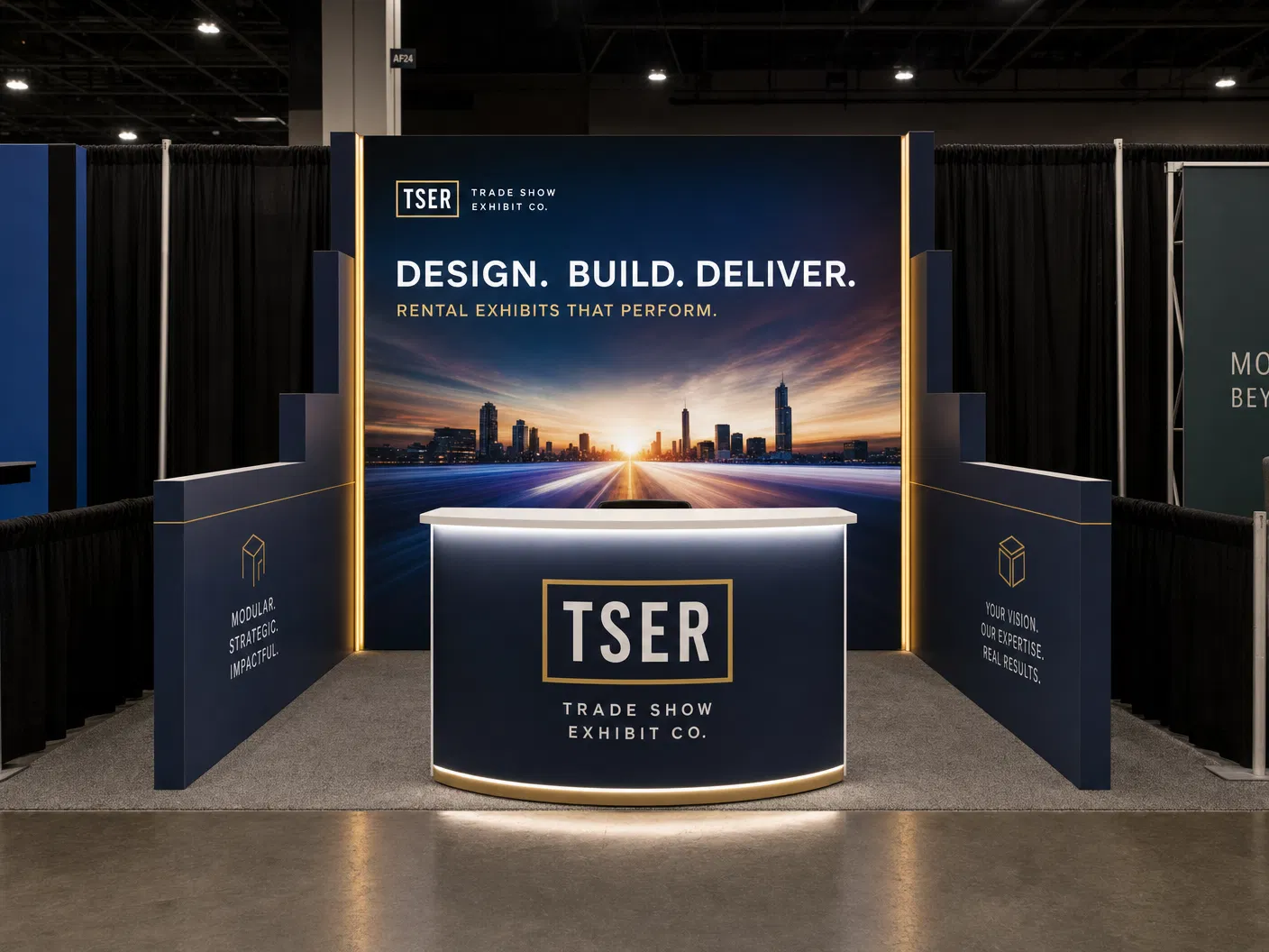
10 x 20 Exhibit Rental — Segmented storytelling inline design is built for exhibitors heading to KBIS in Las Vegas. KBIS runs at Las Vegas Convention Center, and this exhibit is built to perform on that floor. On that floor, the segmented storytelling inline design layout works because it gives the exhibit a clean front read, a strong flow inside, and an easy path from the first aisle glance to a real conversation. A more architectural inline direction with clearer content zones and stronger visual rhythm. This is a working rental exhibit, not a decoration: it helps your team get the message across faster, sort traffic, and present the brand with more control during a busy show.
On size, this 10 x 20 inline build gives your team roughly 200 square feet to do three things at once: stop the aisle with a clear front, support finish storytelling and consultation, and keep enough room for staff conversations after the first stop. It does that through clear content zoning, architectural wall rhythm, and stronger story sequence, so the exhibit never collapses into one long wall or one empty open space. That is why it fits KBIS well. The exhibit carries your branding, product story, and meeting space in one easy-to-read sequence, which is what you want when you are renting an exhibit in a market like Las Vegas.
Build quality matters just as much. An exhibit only works if it can be built, packed, and installed without the look falling apart on site. In this design, the rear-wall frame run, controlled front edge, and clean return details are built to keep the inline exhibit within standard sightline rules. That lets us plan the exhibit around the aluminum frame system, SEG graphic spans, monitor count, counter placement, crating, and labor hours up front. General-contractor line-of-sight rules also stay in the plan, so corners, front message walls, and overhead signage do not run into approval or visibility problems on the floor. For a show like KBIS, that gives the exhibit the practical discipline to hold up under real event conditions, from move-in through show hours and on to your next event.
Bottom line: would this exact 10 x 20 exhibit help you at KBIS in Las Vegas? Yes, when your program needs kitchen-and-bath brands that need cleaner finish stories, a stronger hero wall, and a more controlled consultation zone. The hero image and the other views show how the exhibit holds up from every approach, and the details explain why the structure fits the venue, the traffic, and the job the exhibit has to do. This is a real 10 x 20 Exhibit Rental — Segmented storytelling inline design build with the practical planning detail to support pricing discussions, graphics decisions, and a straightforward rental conversation with our team. Call 888-633-5197 or request a quote to get started.
Lo que obtiene con esta construcción
Se nota desde el otro lado del pasillo
A clear hero moment and clear content zoning pull attendees in before they walk past — so more of the right people stop at your exhibit.
Conversaciones más fáciles, más oportunidades
La distribución da a su equipo espacio para recibir, demostrar y conversar sin cuellos de botella, de modo que el tráfico del stand se convierte en conversaciones reales en lugar de una multitud que solo pasa de largo.
Sin sorpresas en el piso de la feria
It is planned to meet Las Vegas Convention Center rules and stays open and on-brand, so it looks the way you expect on day one — with one team handling design, build, and install.
We designed this 10' x 20' build with KBIS in mind — the kind of crowd, pace, and floor you will be working at Las Vegas Convention Center. If that is your show, it is a strong starting point you can make your own.
Puntos clave de planificación
Esto es lo que este stand está diseñado para lograr en el piso de la feria, para que vea el razonamiento detrás antes de definir el alcance de su cotización.
Zonificación clara del contenido
Esta decisión forma parte del diseño desde el principio para que el stand pueda diseñarse, instalarse y atenderse como un solo sistema coherente.
Ritmo arquitectónico de pared
Esta decisión forma parte del diseño desde el principio para que el stand pueda diseñarse, instalarse y atenderse como un solo sistema coherente.
Secuencia de historia más sólida
Esta decisión forma parte del diseño desde el principio para que el stand pueda diseñarse, instalarse y atenderse como un solo sistema coherente.
The design stays realistic to 10' x 20', so structure, message order, and visitor flow do not drift away from the actual exhibit size.
Galería de apoyo
La imagen principal se mantiene como protagonista, pero la galería completa permanece disponible abajo para que su equipo pueda comparar el frente, el tratamiento lateral y la secuencia operativa general antes de pedir revisiones.
Otras direcciones en esta superficie
Estos stands a medida alternativos permanecen visibles aquí con una imagen y un resumen cada uno, para que pueda comparar las direcciones creadas sin perder de vista el diseño actual.

Una dirección inline compacta con la marca central, medios y movimientos de recepción resueltos limpiamente.
NPE en Orlando es una opción adecuada para esta dirección de stand lineal 10 x 20 porque el diseño prioriza una pared trasera de marca compacta y enfoque en medios y mensajes, además de un camino más limpio hacia expositores de manufactura y procesamiento que requieren lógica de historia de maquinaria, secuencia gráfica legible y un borde frontal que pueda calificar el tráfico antes de conversaciones más profundas.

Una dirección más sólida para paredes de presentación para expositores que necesitan más narrativa visual en el pasillo.
InfoComm in Las Vegas is a strong fit for this 10 x 20 inline direction because the design prioritizes expanded message wall and deeper presentation emphasis and a cleaner path into AV and systems brands that need monitors, media rhythm, and a cleaner line between walk-up demos and qualified meetings.

Una dirección inline más profunda construida alrededor de conversaciones semi-privadas, paredes iluminadas y un umbral de medios más fuerte.
MRO Americas en Orlando es una opción adecuada para esta dirección de stand lineal 10 x 20 porque el diseño prioriza una zonificación consultiva en capas y planos de pared arquitectónicos iluminados, además de un camino más limpio hacia expositores de mantenimiento de aviación que requieren mensajes técnicos creíbles, circulación disciplinada y espacio para conversaciones prácticas con compradores.