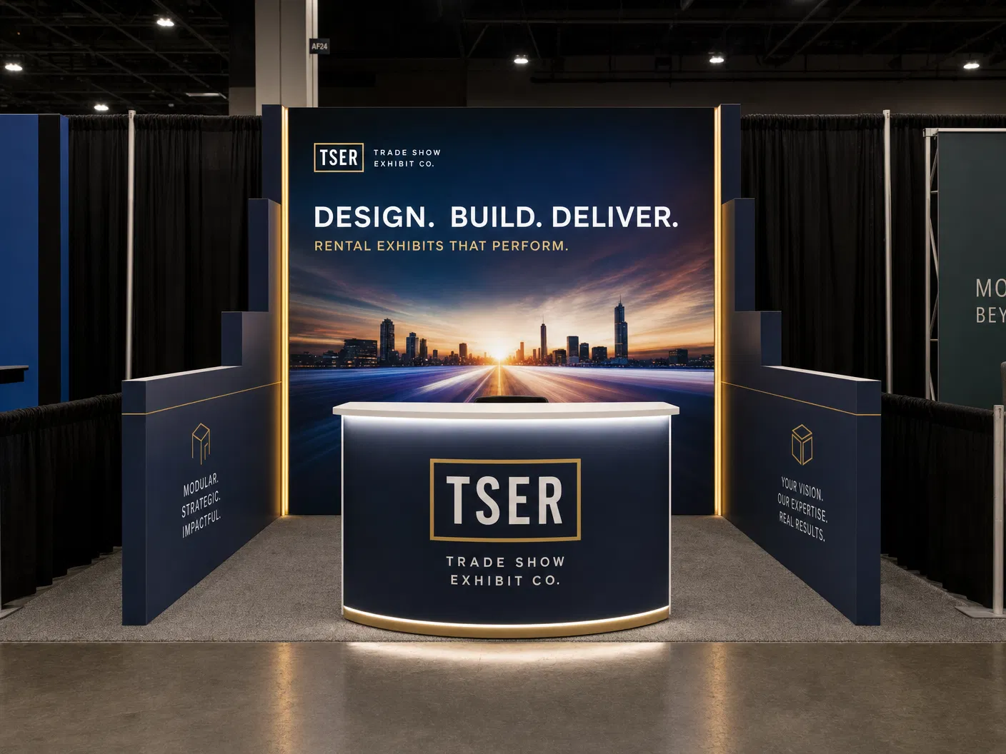


This image illustrates a clean, modular technology exhibit designed for effective product demonstrations. It highlights the use of structured media and clear sightlines to engage attendees without overwhelming them.
- Strong technology exhibit ideas starts with the real sales conversation the team expects to have on the floor.
- The most reliable exhibits for technology exhibit ideas rely on a disciplined message hierarchy, one strong focal move, and a floor plan that respects how attendees actually approach the exhibit.
- Every design has to respect the real geometry of the exhibit.
- Good ideas are only valuable if they survive pricing and show-week execution.
Why technology exhibit ideas has to match the actual show goal
Strong technology exhibit ideas starts with the real sales conversation the team expects to have on the floor. Technology buyers often move quickly, compare vendors aggressively, and need to understand the product story within seconds changes what the exhibit must do. Some programs need clean lead capture and product education. Others need private meetings, live demos, or hospitality. When the exhibit design is chosen before the objective is clear, the result usually looks busy, costs more than it should, and still fails to guide traffic in a useful way.
The better approach is to treat the exhibit as a working environment instead of a decorative backdrop. In practice, that means deciding how much of the available technology-exhibit footprint has to be reserved for product story, how much must remain open for circulation, and how the brand should be recognized from the aisle. Once those decisions are made, the creative direction gets sharper and the program becomes easier to budget honestly.
Idea directions that work better than generic exhibit styling
The most reliable exhibits for technology exhibit ideas rely on a disciplined message hierarchy, one strong focal move, and a floor plan that respects how attendees actually approach the exhibit. A strong demo focal point, controlled lighting, and concise copy supported by layered but disciplined media usually performs better than trying to show every possible capability in one footprint. Buyers read clarity as competence. That is especially true when the exhibit has to compete against louder neighbors on the same aisle.
From a systems perspective, modular engineered aluminum frameworks make it easier to build those ideas without slipping into one-off construction waste. The frame can stay rational while graphics, lighting, counters, media, and product displays create personality. That combination matters because exhibitors want the visual impact of a custom build with the reliability and reuse logic of a modular program.
How footprint and line-of-sight rules shape the design
Every design has to respect the real geometry of the exhibit. A available technology-exhibit footprint cannot carry the same number of gestures as a larger island exhibit, and that limitation is healthy. It forces the design to prioritize. general-contractor line-of-sight rules should be part of the design conversation from the start, especially for inline programs where height transitions and side visibility can quickly create compliance problems if the plan becomes too aggressive.
That is where modular aluminum with integrated media planning helps. The system allows clean spans, disciplined lightbox placement, and more predictable graphic changes without turning the exhibit into a patchwork of improvised pieces. If the design team understands the venue rulebook and the structural system at the same time, the design stays attractive without becoming difficult to fabricate, ship, or install.
Budget, fabrication, and field execution considerations
Good ideas are only valuable if they survive pricing and show-week execution. The budget should be framed in engineering terms: graphic coverage, frame length, counter count, monitor count, lighting, freight class, crate count, and labor hours. When a design cannot be described that way, it is usually still too loose to estimate accurately. Technology exhibit ideas should therefore be filtered through both visual ambition and practical show-floor discipline before the exhibitor commits.
One practical warning is using too many screens without deciding what each one is supposed to communicate and how the exhibit staff will support that message. Exhibitors often underestimate how quickly a promising idea becomes expensive once unnecessary fabrication layers, too many custom finishes, or avoidable media surfaces are added. The cleanest exhibits usually travel better, install faster, and remain easier to update for the next event.
How to turn the design into a stronger 2026 exhibit plan
The fastest way to improve technology exhibit ideas is to build a short brief before looking at visual references. Define the event, venue, footprint, staffing plan, top three messages, must-have demo or meeting needs, and the budget range that can actually be approved. That brief creates a filter for every later design choice and prevents the team from chasing inspiration that does not fit the program.
Once the brief is set, the exhibitor can compare an affordable path against a more tailored modular path and see which direction protects the objective better. That is usually where the best ideas appear: not as random creativity, but as a practical response to audience behavior, venue rules, reusable systems, and the commercial reality of the event calendar.
